

When I am nesting, I sometimes still hear the Target commercial playing in my head "Sweet Happy Life."
When you get ready to move out, you need to do all you can to appeal to most of the people most of the time. You need broad-based appeal.
 |
| my Middle Girlie would love this orange accent wall, but this is not everyone's favorite shade of happy via Apartment Therepy |
Painting and repainting (and re-repainting) is one of my favorite ways to transform a space. Hunky Husband and my Sweet Daddy usually end up doing most of the work -- I am the one with all the vision.
It is a relatively inexpensive way to totally change the feel of a space. Warm/cozy or cool/light. Bold or fresh. Light as a cloud or deep dark cave. I hope you love it as much as I do, because your purchase of Glidden paint keeps HH and his Home Depot pretty busy.
-My colors are bashful and blush.
-Your colors are pink and pink. -- Steal Magnolias
My signature color is 237001 -- the clear bright green that you see all over this blog and all over my house.
When I stage a home to sell, NOBODY CARES what my favorite color is. They want to see the space. They want the light to flood in and fill the rooms. I can't let the wrong colors get in the way of them falling in love with their new place. Neither can you!
 |
| Packer Time via ManLand |
So tone down the neon, the accent wall, and the navy stripes. Lighten up the chocolate dining room, the purple playroom, and the Packer green man cave.
All that being said...please do not think you have to go buy a 5 gallon bucket of builders' white.
 |
| I'm not the only one who loves Navajo. Miss Pam put it all through her open concept home entry, dining, hallway, kitchen. It is the Little Black Dress of neutrals. via Simple Details |
I have painted so many things Navajo that my children think they are next, but it is a really good neutral. It looks good with almost any wood tone. It is just enough color to set it off from white ceilings and white trim. Almost every brand has one of these go-to neutrals Ask any paint salesperson what one color they sell tons of -- broad-based appeal.
 |
| houzz via Pinterest |
Now, gray is the new beige. It has become its own new fake word "greige." Don't feel like you are afloat in a sea of choices from battleship to slate. Try one of the dozen pins from different designers who have picked out some of their favorites. Trust the professionals, but beware of any post that offers only one brand of paint. That one is prolly sponsored by the paint company.

Sometimes you need to tone down a bright color, but still need a touch of the shade to coordinate with your decor. Go to the white section of the paint chips. Pick the white that looks pink, yellow, green or blue. You can get the pastel version of the color without looking like a nursery.
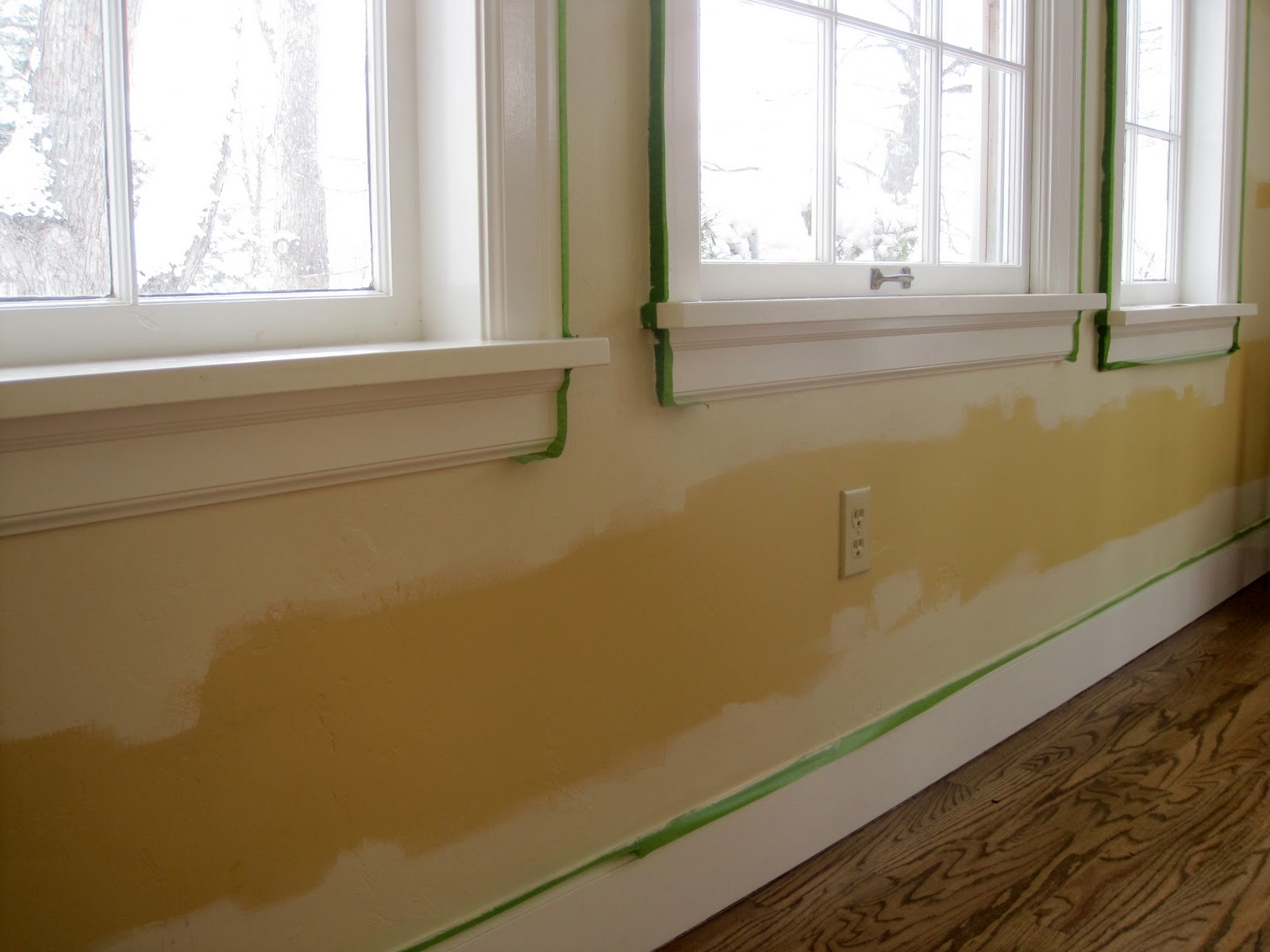
get a gallon of sunshine with an undertone of quick sale,
just bec
check out some of the incredible ideas on these link parties:
before & after party @ thrifty decor chick nifty thrifty tuesday @ coastal charm show me what you've got @ our delightful home tuesday to do @ the blackberry vine get your craft on @ today's creative blog tip me tuesday @ tip junkie tutorials & tips @ home stories a to z take a look tuesday @ sugar bee crafts one project at a time@ a bowl full of lemons tuesdays treasures @ my uncommon slice of suburbia wow me wednesday @ ginger snap crafts tuesday time out @ reasons to skip the housework sugar & spice @ 733 a creative blog whatever goes wednesday @ someday crafts show & share @ southern lovely wow me wednesday @ polka dots on parade under $100 @ beyond the picket fence show off your stuff @ fireflies and jelly beans pinspirational thursday @ the artsy girl connection hooking up with hoh @ house of hepworths strut your stuff @ somewhat simple share awesomeness thursdays @ the 36th avenue a glimpse inside @ catch a glimpse feathered nest friday @ french country cottage freestyle friday @ happy hour projects thursday temptation @ two yellow birds decor flaunt it friday @ chic on a shoestring the pity party @ 30 handmade days weekend wrap up @ tatertots and jello anything goes link party @ bacon time friday free for all @ five days five ways frugal friday @ the shabbby nest mad skills party @ mad in crafts serenity saturday @ serenity you manic monday @ serendipity and spice
Thanks for the shout-out Rebecca! Great tips!
ReplyDeleteMiss Pam, you are my go-to for classy & understated. Thank you for all you do
DeleteFound you via Coastal Charm, and I think your blog is very fun, indeed! Such cute girls, great ideas and anything Disney steals my heart!
ReplyDeleteThank you for stopping by! I love Coastal Charm's link party and her antiques at Cotton City. Hope to see you next time in the Magic Kingdom
DeleteGreat tips for any homeowner! Hopped over from The Blackberry Vine and I'm happy to be your newest follower. Would love to have you stop by for a visit. Blessings ~ Judy @ vintagestreetdesigns.com
ReplyDeleteI love all your painted pieces! I just had a major milk paint fail.Seeing your designs gave me the guts to get back on the horse. Thanx for following
DeleteThanks for the great tips!
ReplyDeleteGreige is a real color...not just a word for gray :). We studied all the best greiges for our house :). It's really interesting how it'll look gray in one light and beige in the other. The best part about it is it doesn't have the pink/orangey tones that beiges do. The gray in it tones that down just enough. Our favorites are Taupe Tone and Loggia by Sherwin Williams.
ReplyDeleteAll great tips!! Thanks so much for stopping by and sharing at The Blackberry Vine!
ReplyDeleteSmiles!
Jami
www.blackberryvine.blogspot.com